Sliiiii—ng. Sling. Sling. Slinging ideas into motion. A Prague-based consultancy bringing new perspectives to the hospitality industry.
Sling was created to establish a consultancy identity that feels serious and professional, while staying approachable, welcoming, and human. In a hospitality world where communication often feels either too corporate or overly aesthetic, the goal was to find a balance between clarity, credibility, and warmth.
The starting point was a clear tension within the Czech hospitality scene. Outside of specialised cocktail bars, cocktail culture in restaurants, hotels, cafés, and bistros is often underdeveloped or treated as an afterthought. The visual identity reflects this through a muted grey tone. It represents both seriousness and a traditional, often uninspired approach to cocktails across the wider industry.
In contrast, purple introduces a new perspective. It signals change, creativity, and fresh thinking. It represents a shift in mindset not only within cocktail bars, but across the entire hospitality field. From hotels to cafés to casual dining.
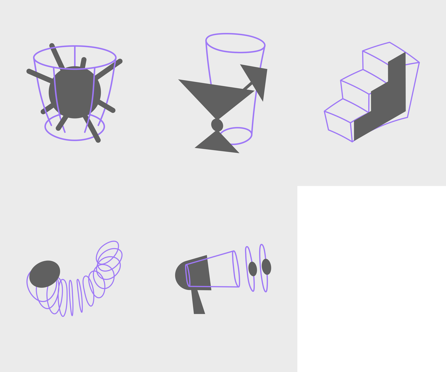
A core visual principle is perspective. It runs through the entire system and challenges the expected way of seeing things. The logotype captures movement and reflects the verb sling as an action that pushes ideas forward and sets change in motion. The purple outline highlights this idea of bringing new perspectives. It appears across the logo and illustrations, adding depth and a slightly unexpected feel to the visuals.
In the end, Sling is a data driven consultancy that turns insight into clear direction, balanced with playful visual elements that keep the system human and approachable. It’s about making hospitality feel a little more considered, a little more curious, and a little more alive.